
Photographers live and work in a visual world. If the world was perfect, they’d be able to sell their services using visual platforms like Pinterest plus a few hits to their website. Unfortunately, photographers still have to drum up business from face to face encounters, and they’re competing with everyone else the potential clients knows with a camera. A good business card can help you build brand recognition and generate leads. The perfect business card will be passed on until it lands you a customer. Here are a few tips for creating the perfect business card for your photography business. 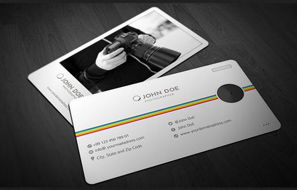
Show Off Your Photography Style
So, you’re a photographer. Do you take wedding photos? Do you take family portraits? Are you taking pictures for businesses, whether it is for product catalogs or ecommerce sites? Your business card needs to communicate this in a visceral way to maximize conversions. You can say you do wedding or family photography, but a logo or design on the card itself that evokes this does so far more effectively.
Express Your Creativity
Photographers are creative professionals. You don’t just have leeway to be creative. You’re almost expected to be so. A simple black and white printed business card with the standard name, address, phone number and website URL counts against you. Use images like pictures of a camera or quality photos of yourself to help sell your services. Be creative with fonts and colors, as long as it doesn’t sacrifice readability. That is, after all, the point of the business card.
Don’t let the lettering be so extravagant that it distracts from the images or logo on the page. Be careful with colors for the same reason. And avoid overly busy text and conflicting patterns or you’ll lose the customer’s interest. You can put the images on the back of the card, a classic solution for photographers, but you run the risk of people not flipping it over. This is a difficult balancing act for a photographers business card. Always use your own imagery, though, since you’ll lose points if you use a stock image and could be hit with a lawsuit if you use someone else’s proprietary images.
Remember the Little Details
Photographers know that the little details can make or break a photo. Red-eye on one key person in the photo or glare in the corner kills it. The same can be true of business cards. Cheap cardstock undermines the lovely photos and crisp text on the business card. Cards that are so shiny that it is hard to read the text hurt you, too. You can use business cards with texture, but you don’t want to run the risk of the card being damaged when put in someone’s pocket. Colors that blend in with the text make the business card hard to read. Conflicting fonts and too many of them distract from the message. Never hurt the readability of your business card, and ensure that the most important information is the most prominent. For example, your name, business name and phone number should have larger, bolder text than your social media profile links.